"Logos do not need or have to be super exciting, they just need to work"
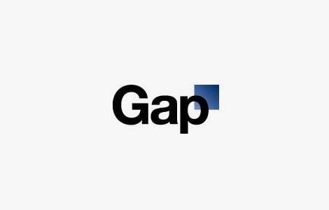
The new "Gap" logo seems to be the subject of some controversy at the moment so this is perfect timing.
The blue box GAP logo has worked for many years, it's become embedded into American culture and has become iconic. Customers trust brands and Gap's been around since 1969 so when they next pop into a store and see that their trusted and reliable place to buy their clothes has almost "Tossed away its legacy"they lose that faith. There was no need for a re brand in my opinion .To blame the original logo on GAP’s downward spiral as a high street fashion shop is just naive poppycock.
Any company should feel proud to have a mark like this, it’s pretty much timeless, which is what we all strive to create, it’s stylish, its memorable and compact. So OK, time for change, most major brands go through a refresh or complete overhaul at some point, but GAP really needed to pull something special out of the bag, decades of the blue box logo are hard to forget.
It’s in our nature to compare old with new, sometimes the re-brand is a success, sometimes it goes catastrophically wrong. I do wonder if brands hiring massively expensive agencies for the initial logo design is such a good idea. Too many people involved, too many people to please and too many people interfering with the design process.
 "So okay, lets look at the new logo"
The thing that worked for the original logo was that it was instantly recognizable,iconic. But now they've replaced it with some generic typeface. I bet the only reason they kept the blue square (But very cheekily scaled it down and swept it to the corner) was to drawn some distinction. It just does not work. Perhaps (strong emphasis on the perhaps) it would work if it was just the type on its own but its not "own-able" and it'll be hard to match that level of individuality they once had using helvetica.


No comments:
Post a Comment