
Wim Crouwel's new alphabet
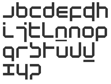
I love.Neh.ADORE this typeface.It was a theoretical exercise which is what i love most about it.Graphics to me involves improving on something that doesn't work.Even if its to the point of illegibility.I love how it
doesn't matter whether it's readable or not.The morphology of the typefaces is what actually matters.Design involves creative freedom and if that means ditching curves of letterforms then so be it.

Wims typeface has been used for Joy Divisions album;Substance.But as you can see it has been altered abit to make it more legible for the market.
No comments:
Post a Comment